数据展示及可视化
数据可视化的重要性
基本图表的绘制及应用场景
数据分析常用图标的绘制
Pandas及Seaborn绘图
其他常用的可视化工具
数据可视化准则
- 真实性(Truthful)
- 功能性(Functionality)
- 美观(Beauty)
- 深刻性(Insightful)
- 启发性(Enlightening)
1 | #导入工具 |
1 | anscombe_df = sns.load_dataset('anscombe') |
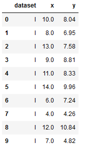
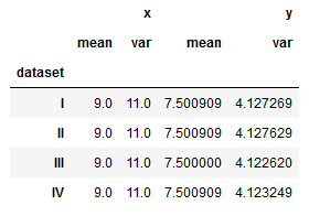
- 查看样本方差
1 | anscombe_df.groupby('dataset').agg([np.mean, np.var]) #var是样本方差 |
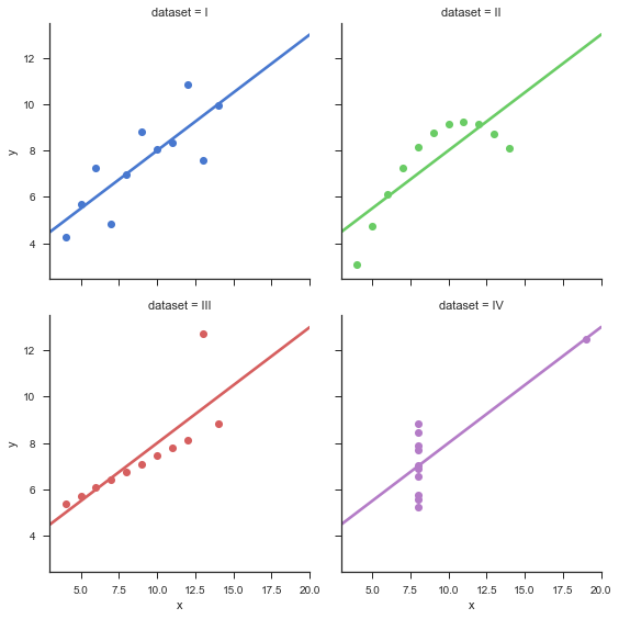
- sns可视化
1 | sns.set(style="ticks") |
基本图表的绘制及应用场景
Matplotlib
- 用于创建出版质量图表的绘图工具库
- 目的是为Python构建一个Matlab式的绘图接口
- import matplotlib.pyplot as plt
- pyplot模块包含了常用的matplotlib API函数
Matplotlib构架
- Backend层
- 用于处理向屏幕或文件渲染图形
- 在Jupyter,使用inline backend
- 什么是backend
- Artist层
- 包含图像绘制的容器,如Figure,Subplot及Axes
- 包含基本元素,如Line2D,Rectangle等
- Scripting层
- 简化访问Artist和Backend层的过程
1 | # 用于在jupyter中进行绘图 |
1 | # Backend |
结果:
1 | 'module://ipykernel.pylab.backend_inline' |
使用matplotlib.pyplot直接绘制
1 | import matplotlib.pyplot as plt |
- 使用scripting
1 | #使用scripting层绘制 |
pyplot
- pyplot
- 可通过gcf(get current figure)获取当前图像对象,gca(get current axis)获取当前坐标轴对象
- 可以通过pyplot.plot()进行绘图,其底层调用的还是axes.plot()函数
- 多参考相关的API文档
1 | #gca获取当前坐标对象 |
- matplotlib会自动用颜色区分不同数据
1 | # matplot 会自动用颜色区分不同的数据 |
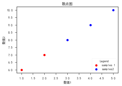
散点图
- plt.scatter()
- scatter_API
- zip封装及解包
- 坐标标签plt.xlabel(),plt.ylabel(),标题plt.title(),图例plt.legend()
- 颜色、标记、线性
- axplot(x,y,’r–’) 等价于ax.plot(x,y,linestyle = ‘–’,color = ‘r’)
1 | import numpy as np |
- 改变颜色及大小
1 | # 改变颜色及大小 |
- 用zip合并为一个新的列表
1 | # 使用zip合并两个列表为一个新列表 |
结果:
1 | <class 'zip'> |
- 使用*进行对元组列表解包
1 | # 使用*进行对元组列表解包 |
结果:
1 | (1, 2, 3, 4, 5) |
- 设置中文字符
1 | plt.figure() |
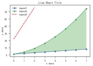
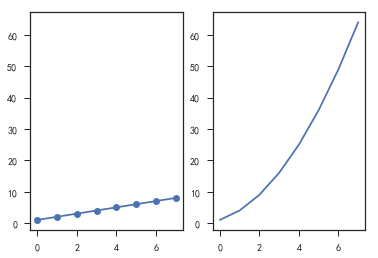
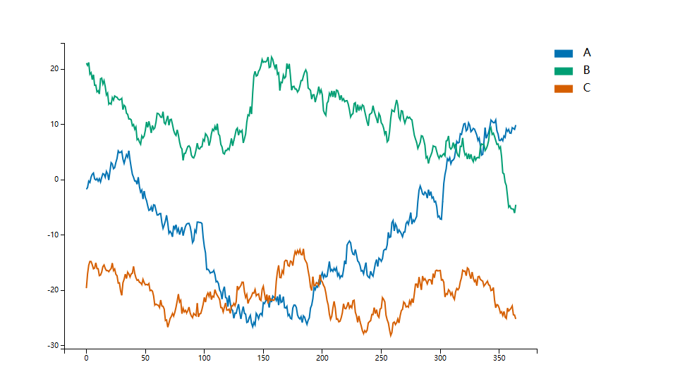
线图
- plt.plot()
- 填充线间的区域
- plt.gca().fill_between()
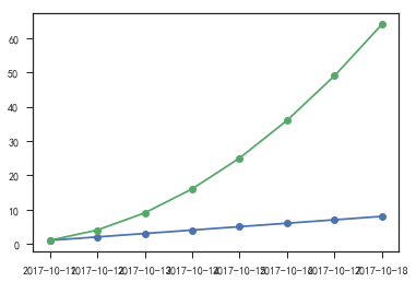
- np.array()生成时间数据
- np.array(‘2017-01-01,’2017-01-08’,dtype = ‘datetime64[D]’)
- 绘制图像的坐标轴为时间数据时,可以借助pandas的to_datetime()完成
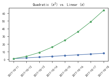
- 旋转坐标轴文字的方向
- plt.xticks(rotation = )或遍历ticks进行set_rotation()
- 调整边界距离,plt.subplots_adjust()
- plot
1 | import numpy as np |
- 绘制横轴为时间的线图
1 | # 绘制横轴为时间的线图 |
- 借用pandas绘制横轴为时间的线图
1 | # 借助pandas绘制横轴为时间的线图 |
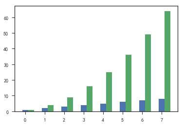
柱状图
- plt.bar()
- group bar chart
- 同一副图中包含多个柱状图时,注意要对x轴的数据做相应的移动,避免柱状图重叠
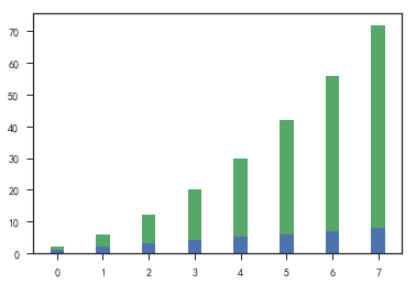
- stack bar chart
- 使用bottom参数
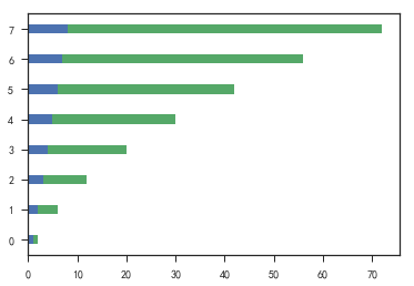
- 横向柱状图
- barh
- 相应的参数width变为参数height;bottom变为left
1 | plt.figure() |
- 重叠柱状图
1 | # stack bar chart |
- 横向柱状图
1 | # 横向柱状图 |
应用场景
- 散点图,适用于二维或三维数据集,但其中只有两维需要比较
- 线图,适用于二维数据集,适合进行趋势的比较
- 柱状图,适用于二维数据集,但只有一个维度需要比较,利用柱子的高度反映数据的差异
数据分析常用图标的绘制
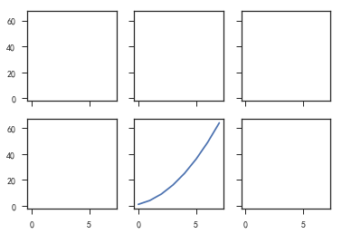
Subplots
- plt.subplots() 建立子图
- subplot_api
1 | %matplotlib inline |
- 保证子图坐标范围一致
1 | # 保证子图中坐标范围一致 |
- 建子图
1 | #建子图 |
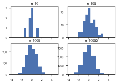
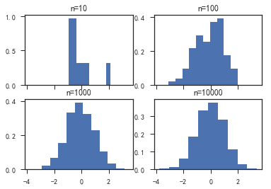
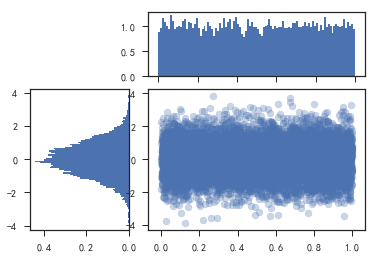
直方图
对数据分布情况的图表示
首先要对数据进行分组,然后统计每个分组内数据的数量
作用:
显示各分组频率或数量分布的情况
易于显示各组之间频率或数量的差别
plt.hist(data,bins)
data:数据列表
bins:分组边界或分组个数
1 | fig, ((ax1, ax2), (ax3, ax4)) = plt.subplots(2, 2, sharex=True) |
1 | fig, ((ax1, ax2), (ax3, ax4)) = plt.subplots(2, 2, sharex=True) |
- 使用gridspec和直方图绘制一个复杂的分析图
1 | # 使用gridspec和直方图绘制一个复杂分析图 |
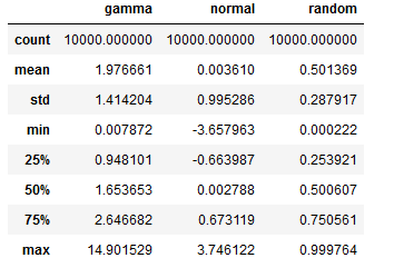
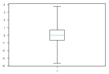
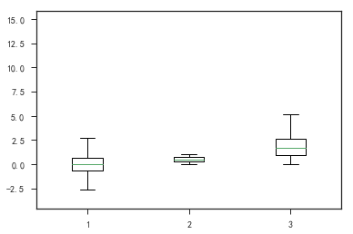
盒形图
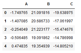
1 | import pandas as pd |
1 | df.describe() |
- 盒形图
1 | plt.figure() |
1 | plt.figure() |
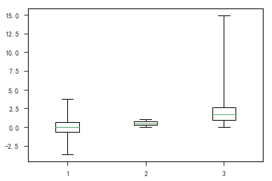
1 | plt.figure() |
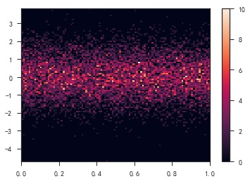
热图
- 热图_api
- 可用于三维数据的可视化
- plt.imshow(arr)
- plt.hist2d()
- plt.colorbar()添加颜色条
1 | plt.figure() |
结果:
1 | (array([[ 0., 0., 0., 0., 0., 4., 8., 12., 29., 26., 41., |
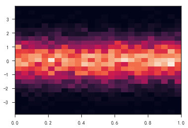
- 热度
1 | plt.figure() |
Pandas及Seaborn绘图
Pandas
- df.plot(kind = )
- kind用于指定绘图的类型
- pd.plotting.scatter_matrix()
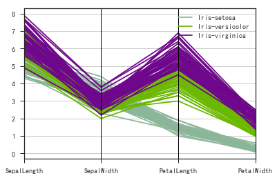
- pd.plotting.parrallel_coordinates()
- dataframe绘图
1 | import pandas as pd |
1 | # panda绘图,可用的绘图样式 |
结果:
1 | ['bmh', |
- 设置绘图样式
1 | # 设置绘图样式 |
1 | #dataframe绘图 |
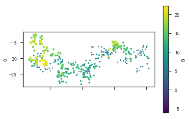
- 散点图绘图
1 | df.plot('A', 'B', kind='scatter') |
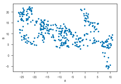
1 | # 颜色(c)和大小(s)有'B'列的数据决定 |
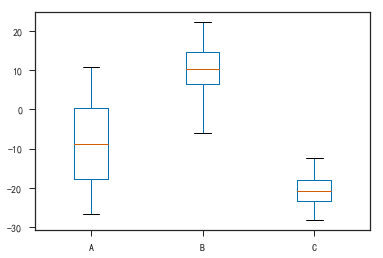
- 盒形图
1 | df.plot(kind='box') |
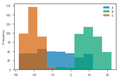
- 直方图
1 | df.plot(kind='hist', alpha=0.7) |
- 拟合分布图
1 | df.plot(kind='kde') #拟合分布图 |
- 查看变量间的关系
1 | #pandas.tools.plotting |
1 | # 用于查看变量间的关系 |
- 查看多变量分布
1 | # 用于查看多遍量分布 |
Seaborn
- 一个制图工具库,可以制作出吸引人的,信息量大的统计图
- 在Matplotlib上构建,支持numpy和pandas的数据结构可视化,甚至是scipy和statsmodels的统计模型可视化
特点:
- 多个内置主题和颜色主题
- 可视化单一变量、二维变量用于比较数据集中各变量的分布情况
- 可视化线性回归模型中的独立变量及不独立变量
- 可视化矩阵数据,通过聚类算法探究矩阵间的结构
- 可视化时间序列数据及不确定性的展示
- 可在分各区域制图,用于复杂的可视化
安装:
- conda install seaborn
- pip install seaborn
数据集分布可视化
- 单变量分布 sns.ditplot()
- 直方图 sns.distplot(kde = False)
- 核密度估计 sns.distplot(hist = False)或sns.kdeplot()
- 拟合参数分布 sns.distplot(kde = False,fit = )
- 双变量分布
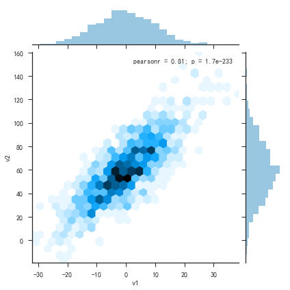
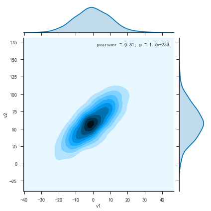
- 散布图 sns.joinplot()
- 二维直方图 Hexbin.sns.jointplot(kind = ‘hex’)
- 核密度估计 sns.jointplot(kind = ‘kde’)
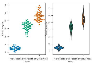
类别数据可视化
- 类别散布图
- sns.stripplot() 数据点会重叠
- sns.swarmplot() 数据点避免重叠
- hue指定子类别
- 类别内数据分布
- 盒子图 sns.boxplot,hue指定子类别
- 小提琴图 sns.violinplot(), hue指定子类别
- 类别内统计图
- 柱状图 sns.barplot()
- 点图 sns.pointplot()
- 类别内统计图
1 | #导入seaborn工具 |
1 | np.random.seed(100) |
1 | # 通过matplotlib绘图 |
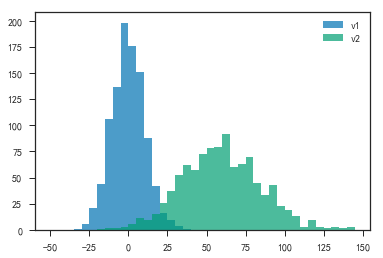
- 绘制直方图和折线拟合
1 | plt.figure() |
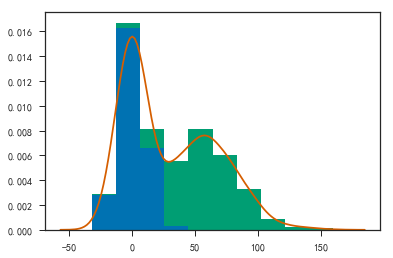
- 使用seaborn绘图
1 | # 使用seaborn绘图 |
1 | # 使用seaborn绘图 |

1 | # 使用seaborn绘图 |
1 | plt.figure() |
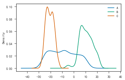
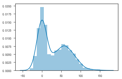
- 密度曲线
1 | plt.figure() |
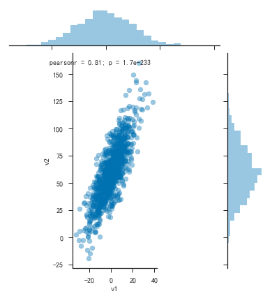
- 密度曲线图
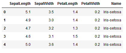
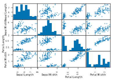
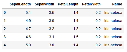
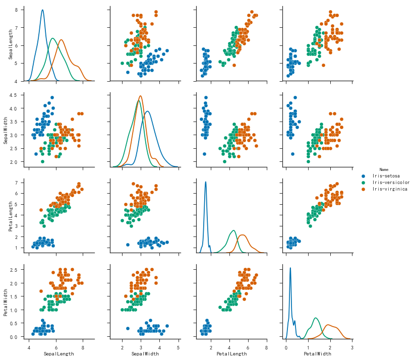
1 | iris = pd.read_csv('iris.csv') |
1 | sns.pairplot(iris, hue='Name', diag_kind='kde') |
1 | plt.figure() |
其他常用的可视化工具(可交互)
D3.js
- D3(Data- Driven Documents),是一个用动态图形显示数据的JavaScript库,一个可视化工具
- mpld3
- 参考链接
- pip install mpld3
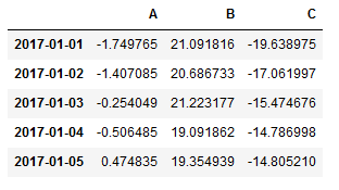
1 | import pandas as pd |
1 | ##交互式图例 |
1 | np.random.seed(100) |
- 查看列的名字
1 | df.columns.values |
结果:
1 | array(['A', 'B', 'C'], dtype=object) |
- 绘制的是一个交互式图
1 | fig, ax = plt.subplots(figsize=(12, 8)) |
1 | #图像保存成html |
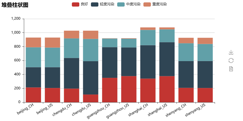
echarts
- 一个纯Javascript的图标库,可以流畅的运行在PC和移动设备上,兼容当前绝大部分浏览器,底层依赖轻量级的Canvas类库ZRender,提供直观,生动,可交互,可高度个性化定制的数据可视化图标。
- pyecharts
- 参考链接
- pip install pyecharts
- 详细用法
- 与Python进行对接,方便在Python中直接使用数据生成图
1 | #柱状图交互式图例 |
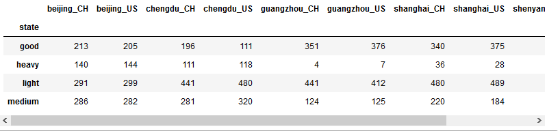
- 堆叠柱状图也是一个交互式图
1 | good_state_results = comp_df.iloc[0, :].values |
1 | # 保存结果到html |
相关链接:源文件